
Why Doesn't My Tube Match My Carton? The Science Behind Packaging Color Variation
Why Your Tube and Carton Never Look Exactly the Same
If you've ever unboxed a sample run and noticed your tube looks a shade darker or lighter than your carton, you're not imagining things — and it's not a printing mistake either. It's physics.
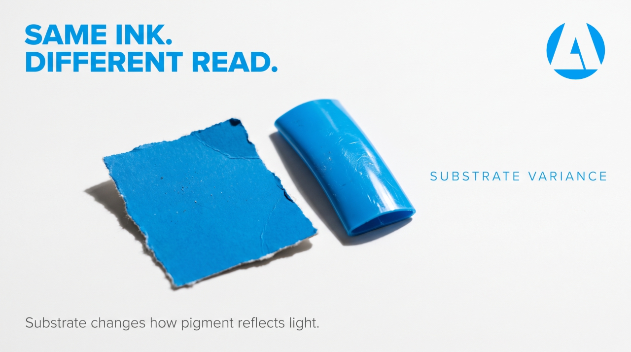
The same ink color can look noticeably different depending on what it's printed on. A plastic tube and a paperboard carton are two completely different surfaces, and each one interacts with light, ink, and color in its own way. Understanding why helps brand owners set realistic expectations and work more effectively with their manufacturing partner.
Why This Actually Matters for Your Brand
Packaging is often the first physical touchpoint a customer has with your product. If the carton on the shelf looks like a different shade than the tube inside, it can read as an inconsistency — even if the ingredients and formulation are flawless. For brand owners scaling into retail or export markets, color consistency across every packaging component is part of what makes a brand look established rather than makeshift.
The Science: Why Plastic and Paper Render Color Differently
Surface structure changes how ink sits
Paperboard is porous. Ink soaks slightly into the fibers, which affects how much pigment stays on the surface and how it scatters light. Plastic, on the other hand, is non-porous and smooth. Ink typically sits on top of the surface or on a primer coating, which changes how it reflects light back to your eye.
Opacity and base color aren't the same
Cartons are usually printed on bright white, coated paperboard, which gives ink a clean, neutral base to sit on. Plastic tubes vary — some are naturally translucent, some require a white basecoat before printing, and some have a slight tint depending on the resin used. Even a tiny difference in base whiteness changes how a color appears once ink is applied over it.
Gloss and matte finishes bend light differently
A glossy laminate tube reflects light in a focused, mirror-like way, which can make colors appear richer or more saturated. A matte-finish carton scatters light more evenly, often making the same color look slightly softer or more muted. Neither is wrong — they're just behaving according to their finish.
Printing methods differ by material
Cartons are commonly printed using offset lithography, which is highly precise for paper stock. Tubes are often printed using flexography, screen printing, or digital methods suited to curved or flexible plastic surfaces. Each method has its own ink density, resolution, and color reproduction characteristics, which means even the exact same Pantone code can render with subtle variation from one process to the next.
Pantone Guides Aren't One-Size-Fits-All
Here's something many first-time brand owners don't realize: Pantone itself publishes separate color guides for coated paper, uncoated paper, and plastics — because the company that created the color-matching standard acknowledges that substrate changes appearance. Specifying "Pantone 2685C" for your carton and expecting an identical result on a plastic tube skips a step, since the "C" (coated) reference wasn't designed with plastic substrates in mind. This is a formulation-adjacent detail that's easy to miss but has a real, visible impact on brand consistency.
What Brand Owners Can Do About It
Request substrate-specific color proofs
Before approving a full production run, ask for a physical proof on the actual tube material and the actual carton stock — not just a digital mockup. Screen colors and printed colors are two different things entirely.
Define an acceptable tolerance, not a perfect match
In the packaging industry, color variation is typically measured using a metric called Delta E, which quantifies the visible difference between two colors. A small Delta E value is generally considered visually acceptable, even to a trained eye. Ask your manufacturer what tolerance range they work within, and set that expectation early.
Understand that "close" is often the realistic goal
A perfect, identical match between plastic and paperboard is rarely achievable with standard commercial printing. What's achievable — and what matters for brand perception — is a close, intentional, consistent match that doesn't look jarring side by side.
Loop in your manufacturing partner early
Packaging color decisions work best when they happen alongside formulation and branding, not as an afterthought. At Acticon Life Sciences, packaging compatibility and color consistency are part of the broader quality process brand owners go through before a product reaches shelf-ready stage, alongside stability testing and formulation review.
Common Myths About Packaging Color Matching
Myth: "One Pantone code guarantees an identical look everywhere." In reality, the substrate, printing method, and finish all influence the final appearance, even with the same code specified.
Myth: "If the colors don't match, the manufacturer made an error." Not necessarily. Some variation between plastic and paper is a known, expected outcome of how each material interacts with ink and light — not a quality failure on its own.
Myth: "Digital mockups are a reliable preview of final color." Screens display color using light (RGB), while printed packaging uses ink (CMYK or spot colors). The two systems don't translate one-to-one, which is why physical proofs matter.
Frequently Asked Questions
Why does my tube look darker than my carton even though I used the same color code? This usually comes down to substrate differences — plastic and paperboard absorb and reflect ink differently, which changes how the same color appears on each material.
Can this color variation be completely eliminated? It can be minimized through substrate-specific color matching and tighter tolerance settings, but a 100% identical match across different materials isn't typically achievable with standard printing processes.
What is Delta E, and why does it matter? Delta E is a numerical measure of the visible difference between two colors. Manufacturers use it to define how close a printed color needs to be to the target before it's considered acceptable.
Should I approve packaging based on a digital design file? It's best to request a physical proof on the actual substrate before final approval, since screen colors don't always translate accurately to printed materials.
Does this affect product safety or quality? No — color variation between packaging substrates is a visual and branding consideration, not an indicator of formulation quality or product safety.
Small details like packaging color consistency are part of what separates a polished, retail-ready brand from one that still feels early-stage. Acticon Life Sciences works with brand owners through formulation, packaging compatibility, and quality checks to help products look and perform as intended, from tube to carton to shelf.